

A primer on data science
Described as the "sexiest job of the 21st century" by Harvard Business Review, data science has penetrated the annals of business history in the last decade. Leaders today would be wise to harness this powerful capability, and consider the recent guidance from McKinsey & Company's 2017 quarterly report:
"While CEOs and other members of the executive team don’t need to be the experts on data science, they must at least become conversant with a jungle of new jargon and buzzwords (Hadoop, genetic algorithms, in-memory analytics, deep learning, and the like) and understand at a high level the limits of the various kinds of algorithmic models. In addition to constant communication from the top that analytics is a priority and public celebration of successes, small signals such as recommending and showing up for learning opportunities also resonate."

Click image to download the McKinsey Quarterly report (PDF)
What does data science mean
Data science is defined as:
An interdisciplinary field about scientific methods, processes, and systems to extract knowledge or insights from data in various forms, either structured or unstructured, similar to data mining.
Additionally, data science is a "concept to unify statistics, data analysis and their related methods" in order to "understand and analyze actual phenomena" with data.
Why data science matters
The complexity of data science lends itself to rabbit holes, corner cases, and the risk of getting mired in a blackhole of minutiae. So let's first agree on why data science actually matters: IT HELPS BUSINESSES MAKE BETTER DECISIONS. That's about it.
Having personally endured dozens of data science briefings, the most valuable outcome is unequivocally a better informed decision.
Technology has spawned a galaxy of information that's so big Google requires 4-5 million servers just to keep up. Today's executive have, at their finger tips, more data than any team of humans can analyze. Therefore, we must employ new tools and tactics to make sense of the information.
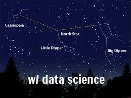
Data science helps you connect the dots, allowing you to see patterns. A regression model might reveal a constellation in the night sky you've never seen before. A classification model might yield an insight as important as the north star. Valuable knowledge awaits.

Knowledge = Power?
Contrary to popular thought, however, knowledge by itself is NOT power. It is simply potential power. Knowledge + ACTION = power. And it is here where so many brilliant data science endeavors fail to launch.
To address this conundrum, it is recommended your data science/analytics folks form a working relationship with your business operations team. This handshake is crucial because each data science output, e.g. churn predication score, etc. must be accompanied by an operational rollout plan with an expectation of accountability from management.
Resources to share
If you are considering starting—or furthering—your data science efforts, below are a few resources & tips you may wish to share with your team:
Most teams today are building their data science models in Python
The SciKit-Learn website has free, open source tools for efficient data mining
Pandas is arguably the best python library for data framing (here is a tutorial)
You can use ROC curves to evaluate your data science output, e.g. applied to renewal rate
Want to simply explore the many uses of data science? Check out: The Information Diet
For the more advanced readers, you can delve into Google's machine intelligence library: TensorFlow
The DBT Ventures team hopes this information will help your team make sense of the night sky that is today's business canvas.
